
Translating music into a visual language through computation.
Abstract
Computation can function not only as a tool, but also as a language of translation between sound and image.
The Shape of Sound is an exploratory project at the intersection of music, computation, and visual design, aiming to translate the intrinsic features of music into a coherent visual language. Moving beyond traditional audio-reactive graphics, the project integrates computational analysis to make the visualizations accurately reflect musical elements such as tempo, amplitude, rhythm, and frequency.
Leveraging Python for high-level feature extraction and p5.js for real-time graphics, the project demonstrates a holistic approach to music visualization balancing technical rigor in data-driven representation with creative expression, while offering a multisensory tool that can enhance learning and creative understanding in music.
Toolkit
p5.js, python
Award
Dean’s Undergraduate Research Fund
NYU Shanghai, 2023
Links
Trailer Video
Results Overview Try yourself →
Project Background
What is music visualization
When speaking of "music visualization", many people may think of the cool audio players on their phones or live music performances that they have watched, where all the visual patterns and movements dynamically respond to the music and engage audiences in a synchronized experience. However, I would rather call them "audio-reactive visuals" and consider them to be only a specific type of music visualization.
The phrase "music visualization" encompasses a broader concept. While audio-reactive visuals rely on real-time generation of visual effects and movements, music visualization can be either dynamic or static. It focuses on conveying information present in the music and showing the structure of the music in a more conceptual manner.
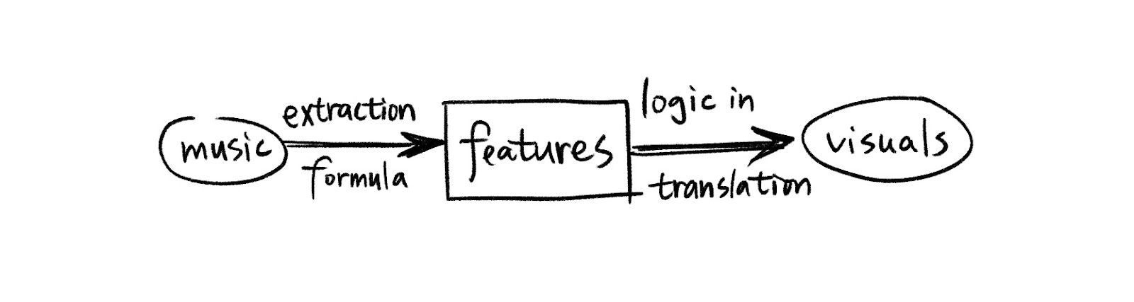
People have to hear the music when they look at the audio-reactive visuals to understand the connection and complementation between the two. However, from my perspective, the viewers of a music visualization piece don't necessarily have to hear the music. To be sure, hearing the source music while watching the piece can help people better understand what's going on. But a music visualization piece emphasizes on the accurate and comprehensive conversion from music to graphics. It's like a translation process from the language of auditory to the language of visual. It gathers information from the imported audio, extract the features, unwrap the logic behind them, and re-encode them into something that can be perceived through vision. Therefore, a music visualization will be able to stand on its own in giving the viewer sufficient information about the source music.
Key factors to consider in music visualization
1. It should be accurate
It's important for music visualization to be informative. For example, it's better to have music features like amplitude, frequency, beats, and timbre reflected in the visuals rather than only making the visuals moving with the beats.
To achieve a better visual appearance, it's completely fine for us to add some randomness to our projects. However, we don't want to cover up the information in the music with the overuse of randomness. There is always a balance to strike between achieving visual pleasure and minimizing information loss.
2. It should be indicative
One crucial aspect of music is its emotion. It can not be explicitly shown through a single visual element and there's no formula to calculate the sentiments in music. However, through deep understanding of music features and the application of color and shape theories, along with designed composition, we will be able to get close to the goal of indicating emotion of the music through visuals.
3. It should be aesthetic
As has been discussed above, it's also important to make the project visually pleasing, otherwise people won't even be interested in appreciating it. Instead of showing the amplitude change over time on a 2-d plot in python, the point of a music visualization project is to convey the information of music in an aesthetic way.
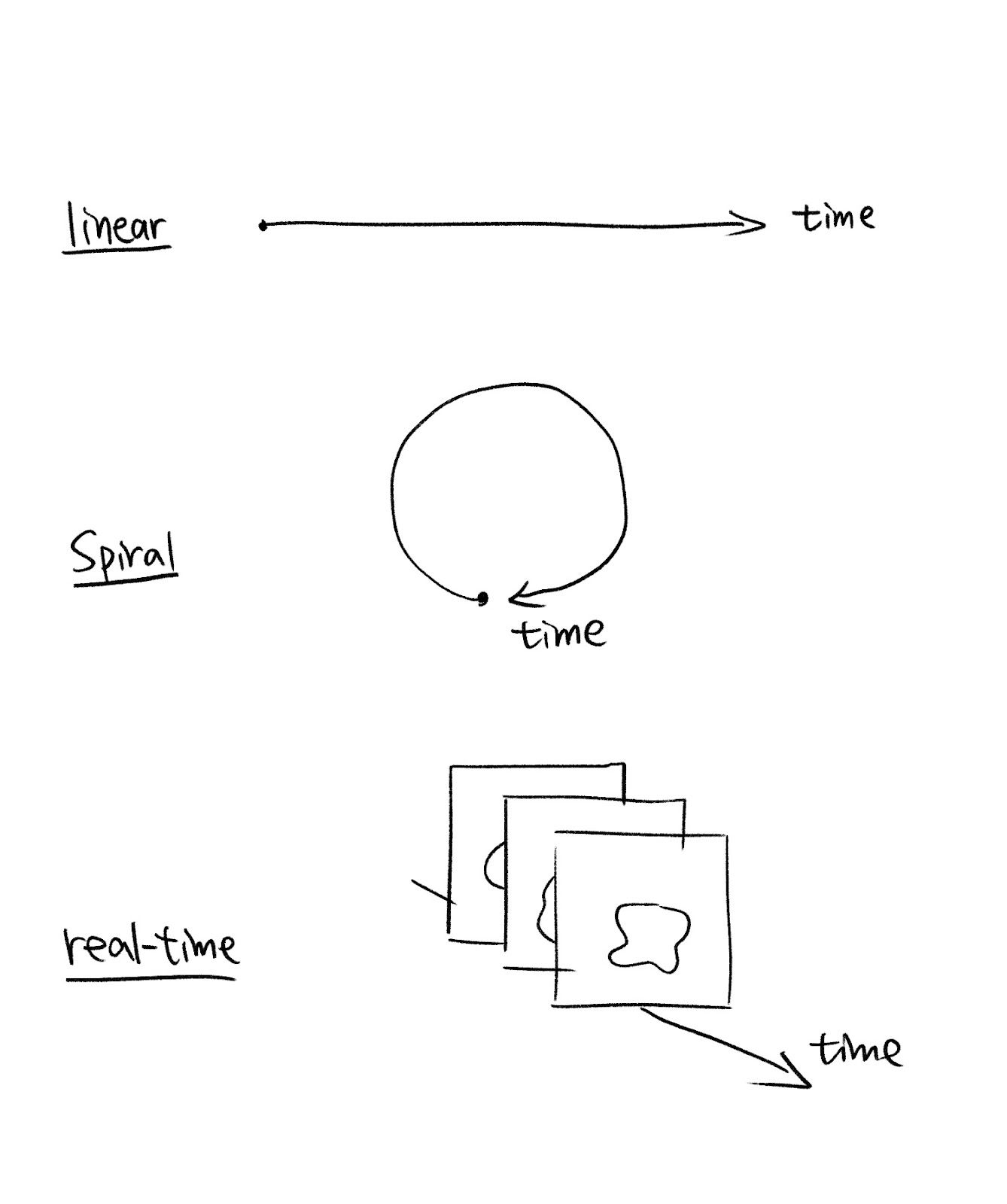
Another important aspect to consider is the display of “time” in our visualization, as time plays an indispensable role in music. Whether our visualization is static or real-time, it’s always the first thing to consider how we are going to show the change of music features over time. Here are several ways to show the time in our visualizations:
Part 2: Methods and Implementation
I mainly use p5.js for creating my music visualization project because it's a friendly platform for artists to create visual experiences, and it contains the sound library and a range of functions for doing sound analysis. I also used Python for extracting some high-level features.
Logic
In the process of my music visualization, there are three main parts: Music, music features, and visual elements. After importing the original music file, I record the music data, and define a series of functions to extract low-level and high-level features from the data. Then, I translate those features into visuals according to my research in the relationship between them.
My goal is to not only show the sound features, but also sentiments underlying them.
Main Components
We can start by asking ourselves a few questions about what the audience may want to know about certain piece of music:
- How fast is the music? (Tempo)
- How strong is the music's energy? (Amplitude)
- How is the rhythm? (Beats)
- How high is the pitch in general? (Frequency)
- What is the flow of the music? (Change in features through time)
- What is the volume distribution in different bands? (Bass, midtone, hightone)
- Where are the highlights? (Notes that stand out)
- How does the music feel like? (Sentiments)
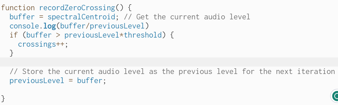
You may be aware of that some of those features are low-level while others are high-level, meaning that we can't get them directly from the raw data (such as waveform and data from FFT), but needs to process low-level features to derive higher-level features. For example, amplitude is a low-level feature because it's shown directly in the height or strength of a sound wave, and we can derive it using basic p5.js functions. However, tempo is a rather higher-level feature because without a music sheet, we can't directly get the tempo from the raw data. Instead, we can first calculate the zero-crossing rate, which is how frequently a signal crosses the zero-axis over a given time interval, and then use the zero-crossing rate to estimate the tempo. Not to mention, sentiments is a high-level music feature, and can only be inferred from analysis of multiple lower-level features.
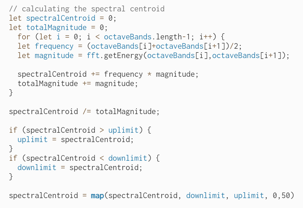
Another example is that we can use a low-level feature, the spectral centroid, to estimate the overall frequency of the music. The spectral centroid is the weighted average of the frequency values. It represents the center of mass of the spectrum. Therefore, a higher spectral centroid indicates a higher concentration of energy towards higher frequencies and vice versa.
The direction of the spectral centroid over time can also provide insights into the flow of the music. For example, an ascending spectral centroid probably indicates a gradual increase in pitch.
After that, we begin to consider how we can show those music features using visual elements.
1. [Tempo]
We can control the speed of generative art to show the tempo. If the tempo is high, then the generating process will be faster. More graphical elements will be generative, therefore they will be more likely to overlap each other and create a intensive feeling.
2. [Frequency]
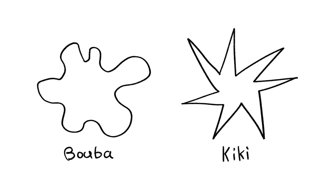
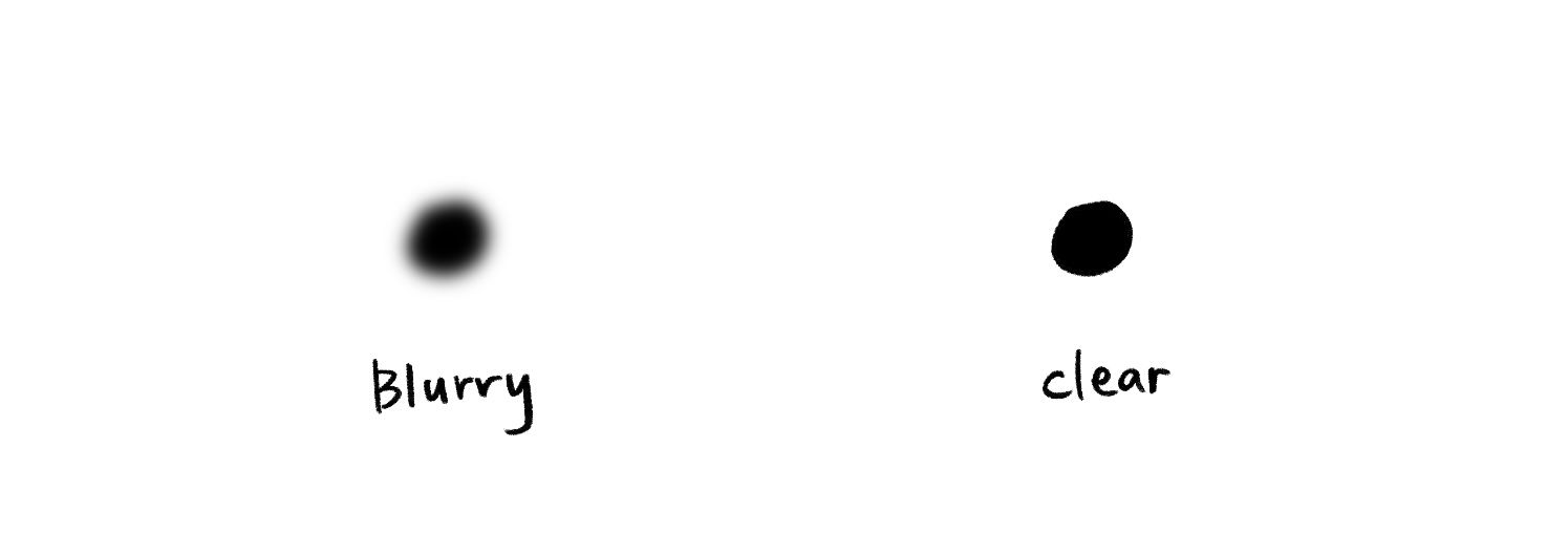
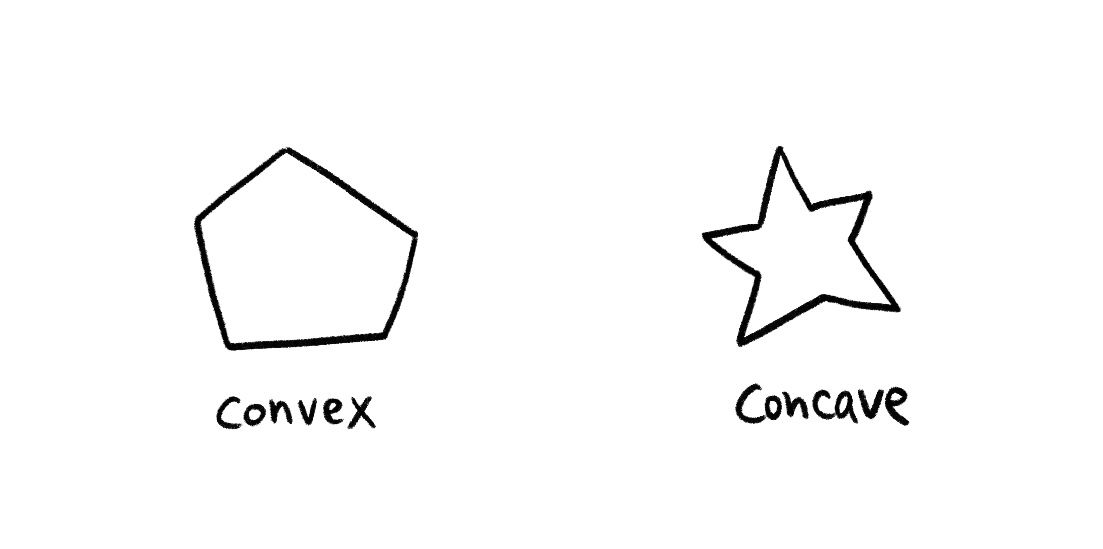
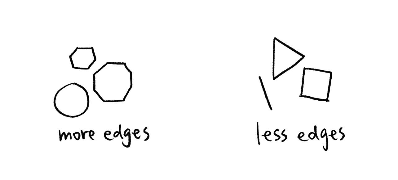
We can use the characteristics of the shape, for example, a smooth, blurry, and convex shape does well in representing a lower frequency, on the contrast, a sharp, clear, and concave shape can indicate a higher frequency.
The famous Bouba & Kiki Theory (Smooth vs Sharp):
Blurry vs Clear:
Convex shape vs Concave shape:
Shape with more edges vs Less edges:
Besides shape, the position of visual elements is also helpful in telling the audience about the frequency. People tend to believe that the elements floating in the top half of the canvas, or those drifting far away from the majority of visual elements represent higher pitches.
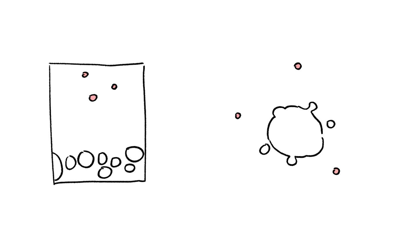
The color of the visual elements also matters to a great extent. Colors with high brightness and saturation represent a higher frequency. What's more, warm colors are often associated with high pitches as they are being "bright" and "sharp", while cold colors are associated with low pitches for being "deep" and "mellow".
3. [Amplitude]
The size of the shape is an intuitive way to describe the amplitude of the sound. Besides size, the transparency also says about the amplitude. A solid and opaque color indicates a higher amplitude, while a color with rather low transparency indicates a lower amplitude.
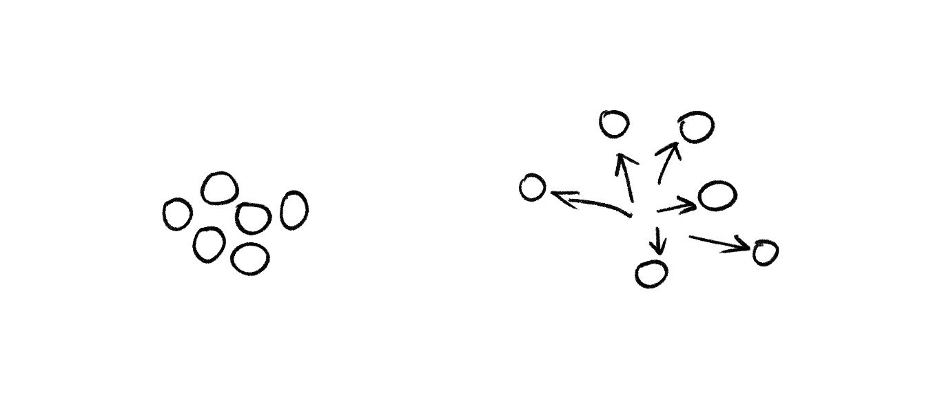
It's also interesting to link amplitude with force. Suppose our visual elements are a mass of matter. When the amplitude is low, the matter tend to cluster together. However, when the amplitude is high, we can imagine a strong force being applied to our matter and push them away in all directions, creating an exploding effect.
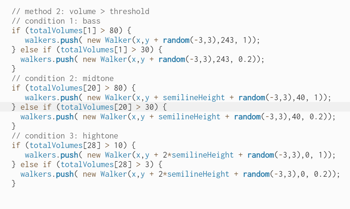
It's important to notice that the change of amplitude is often linked with beats. For example, a kick of drum will reflect in the rapid rise of amplitude in the low-frequency range. Therefore, a good way to visualize the beats is to take the volume distribution in each band from the raw data, find the volume of the bass range, and calculate the changing rate of it to detect the beats. This method will be further discussed in the next part.
From the discussions above, we can conclude a list of main components of music features and visual elements.
| Low-level music features | High-level music features | Visual elements |
|---|---|---|
|
|
|
Feature Extraction
Now we come to the implementation stage. I will explain the feature extraction formula I explored and the way I arrange the visual components to perform sound visualization. There are several basic experiments which focus on dealing with the data and also some iterations that include more aesthetic expression.
Let's start with processing the music data. When looking at the low-level music features in the list above, we will find that they can all be derived from the waveform and the FFT spectrum, which are two essential and commonly used data forms in music analysis.
Waveform
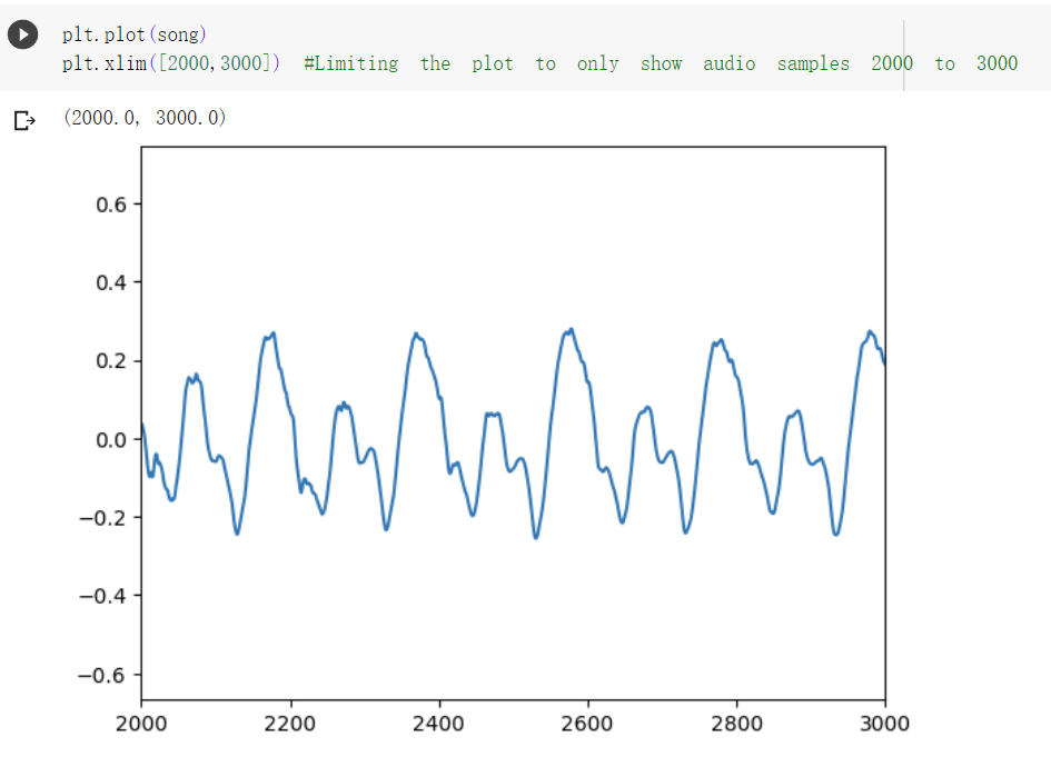
According to the p5.js reference, the p5.wavefrom computes the change of amplitude values along the time domain.
Let's look at this graph, which clearly shows the original shape of the audio waveform (black line) and also the variation of the sound's amplitude over time (red line). The red line here is called the "envelope".
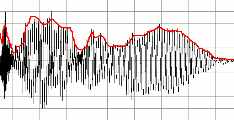
It may seem confusing because the waveform itself is fluctuating violently and is crossing the zero-axis very frequently. It's because it actually reflects the vibration of air particles in the physical case or the change in electrical signal in the digital case.
Let's look at the entire waveform here made with Python. We can clearly see the envelope, which is the amplitude change through time. It's because that all the fluctuations are too compressed to be seen.
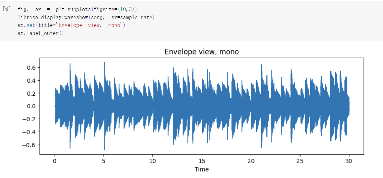
But when we zoom in the waveform and only look at a small part of it, we can see the fluctuation of the signal.
The amplitude is basically the most obvious feature we can get from the waveform. In this sketch, I place the amplitude on a spiral timeline. This is an intuitive visualization of amplitude.
Project name: Snail
Logic: A record of amplitude
However, there's more we can do with the amplitude. In this sketch, I set a threshold and whenever the amplitude goes beyond that threshold, there will be an outburst in the outbound.
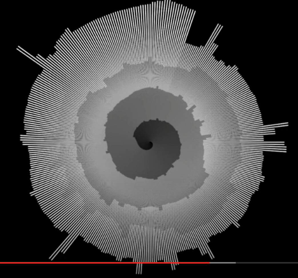
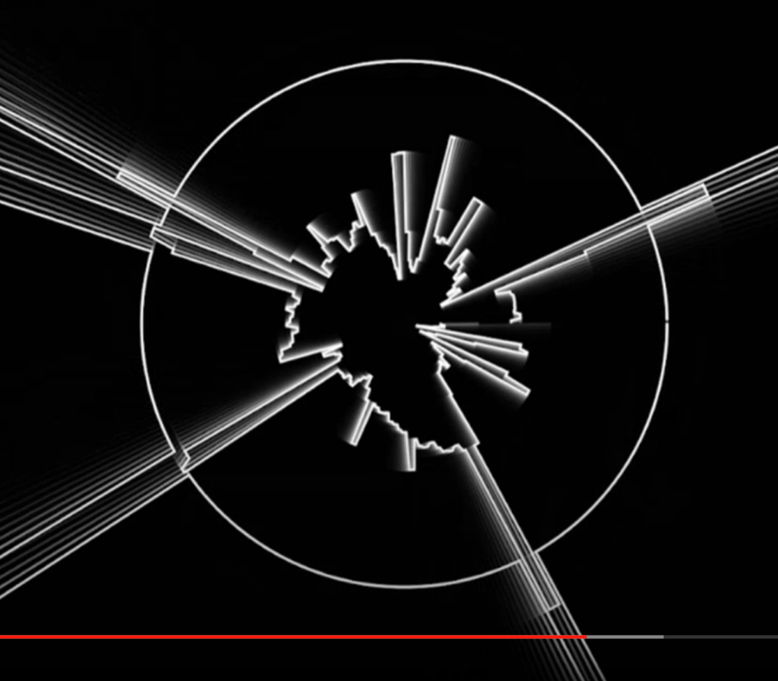
Project name: The city
Logic: Amplitude + threshold
Reference: Radial Graph - The coding train
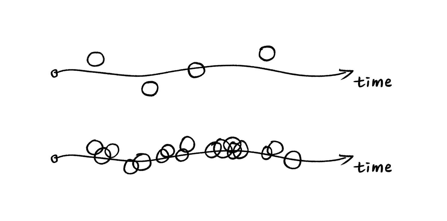
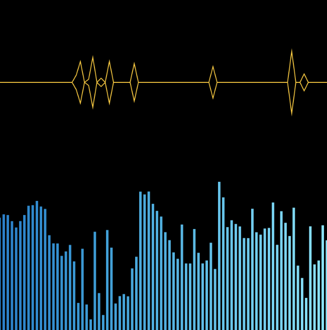
In this sketch, I start to process the data and get higher-level features. I calculated the ratio of the current amplitude over the previous amplitude, and set a threshold for that ratio. For example, if the ratio is more than 1.1, meaning that the current amplitude is larger than 1.1 times of the amplitude in the last frame. The difference is significant enough. Then I will generate a shape whenever the ratio is beyond the threshold. In this way, we can discover the highlight points of this music piece.
Project name: Diamonds
Logic: Amplitude + ratio + threshold
Of course, aside from amplitude, there are other features that we can get from the waveform. One of them is the zero-crossing rate, which measures how frequently a signal crosses the zero-axis over a given time interval. A higher ZCR indicates a higher changing rate and more rapid fluctuation in the signal. Therefore, ZCR is often used to identify the tempo.
Here is the p5.js sketch trying to estimate the tempo based on the zero-crossing rate.
You can also find a similar attempt to do it in python here.
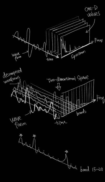
FFT Spectrum
The FFT spectrum applies the Fast Fourier Transform algorithm to a time-domain signal. In a FFT spectrum, the horizontal axis represents the frequencies, while the vertical axis represents the amplitude of each frequency component. The FFT spectrum provides valuable information about the distribution and strength of different frequency bands within a signal over time.

We can view the amplitude as a whole like in the graph below. The amplitude of the sound at a specific moment can be compared to the sum of volume in every single frequency component.
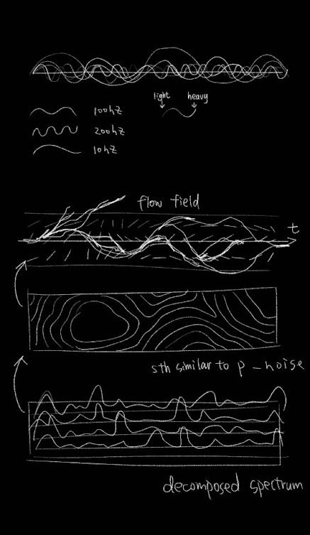
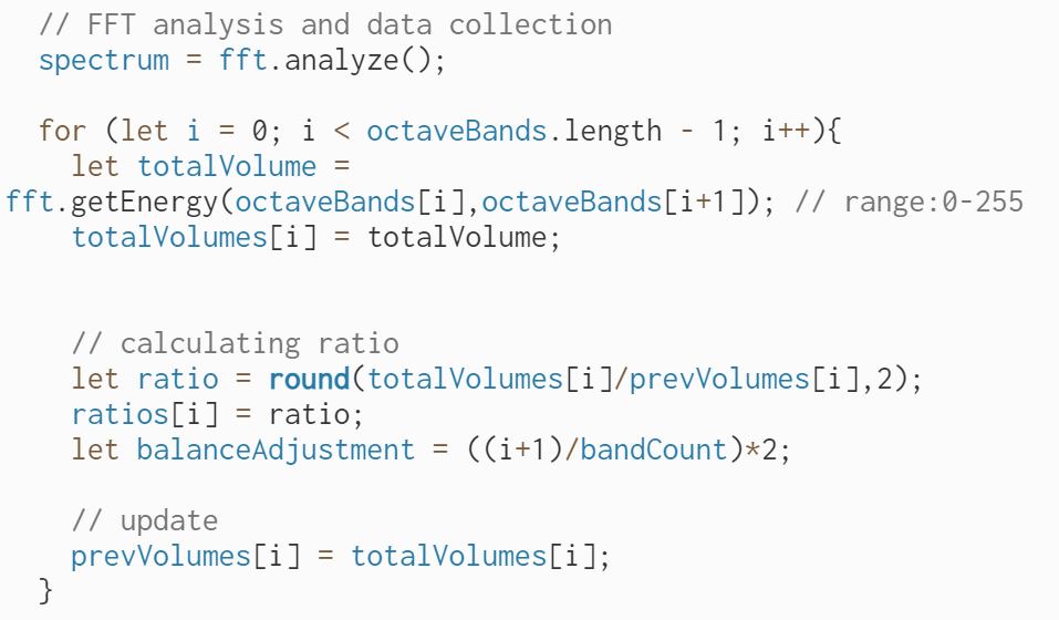
Or we can decompose the waveform based on frequency bands. In each frequency band, we also sum of the volume of every single frequency component. Through this, we will be able to see the change in amplitude in every frequency band.
As you can see, the FFT contains much more information as it can be read as a 3-dimentional data source. But fundamentally speaking, it is still about the changing of amplitude over time, but providing important information about the distribution or relationship among the frequency components. By making good use of this distribution information, we will be able to analyze our music features independently in bass, midtone and hightone, or even self-defined frequency ranges, instead of seeing them as a whole. We can also derive high-level features such as whether the music is harmonious, based on low-level features like the standard distribution of amplitude in each frequency component. (This will be further explained below)
This sketch is an intuitive experiment of calculating the sum of volume in a self-defined frequency range. After getting the sum, I use the old way of calculating the difference ratio and spot the moments that the ratio gets beyond a threshold, i.e. the burst or highlight of that frequency range. There are two frequency regions that can be customized by the users through the GUI (graphic user interface). What is it for? For example, if the user wants to detect the beats in this piece of music, then he can adjust the frequency region around the bass frequency and find the best range that works most accurately in detecting the burst of amplitude. Through this way, he will be able to detect the beats.
Project name: 2 frequency regions
Logic: FFT + frequency range + difference
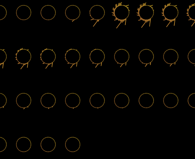
In this sketch, I explored some aesthetic concepts. It is inspired by the film Arrival, in which the aliens have a kind of circular language that contains massive information in it. In this sketch, I place a ring-shaped graphic onto the canvas on a regular time base. It's like writing an article, when a line is done, move to the next line. In every timestamp, I record the distribution of amplitude on the frequency ranges and apply them to the shape of my ring-like graphic.

Project name: Moon phase
Logic: FFT + frequency range
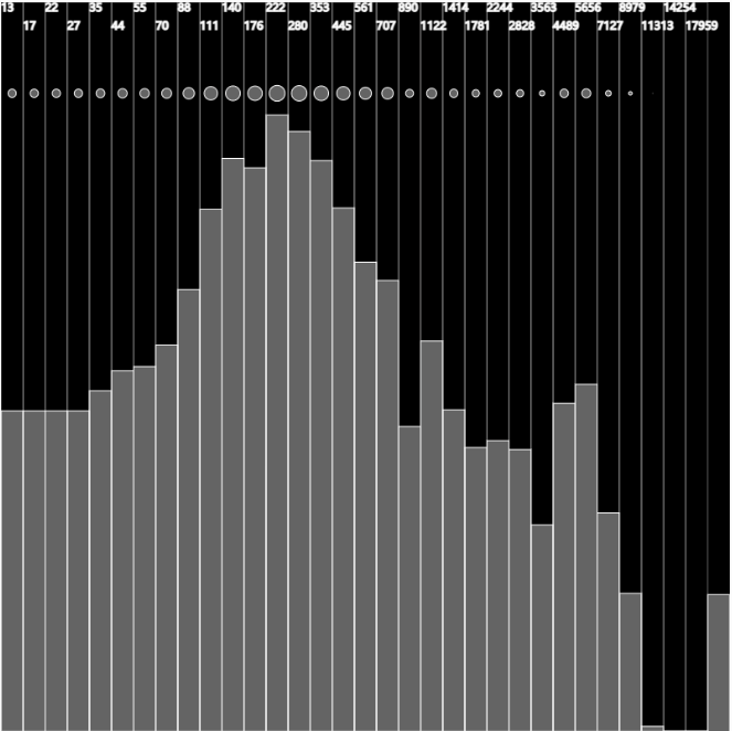
However, p5.FFT has a problem, which is the array of amplitude along the frequency axis is based on index (1023 in total), but not on the actual frequency. In other words, we know a set of amplitude but we don't know the exact frequency that the amplitude is describing.
Therefore, I turned to another method in p5.FFT library which is called the octave bands. It is also a popular way to analyze the sound because it divides the spectrum into a series of non-overlapping bands, each having a width of one octave. We are fully aware of where the boundary of each octave band lies, which help us gain more control of the frequency range being analyzed. Also, the frequency range of octave bands are designed to adapt on human ear perception, which is basically doubling the range for every octave band. You can find more information on octave bands here.
According to the experiments, calculating the sum of the first four octave bands (16-250Hz) works good for beat detection. Here's a sketch that shows the finding visually.
Speaking of beat detection, we've already used two methods: sum of volume in a self-defined region, and sum of volume in the first four octave bands. But then I discovered a different way of detecting beats and it's actually more accurate than any other method.
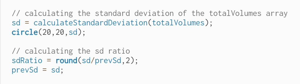
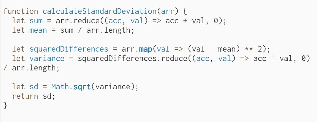
Basically, I define a function for calculating the standard deviation of the amplitudes in all the octave bands. If the standard deviation is low, it means that the amplitude along the frequency axis is rather evenly distributed, which indicates that there's nothing standing out. However, if the standard deviation is high, it means that in some frequencies, the amplitude is far higher than that in the rest frequencies. Something bursts out. Therefore, I again set a threshold for the ratio between current standard deviation value and the previous value, and it turns out to be effective in beat detection.
At this point, I have written some modularized functions that are confident in answering most of the questions that we ask in the beginning:
1. How fast is the music?
Solution: Using the zero-crossing rate to estimate the tempo


2. How strong is the music's energy?
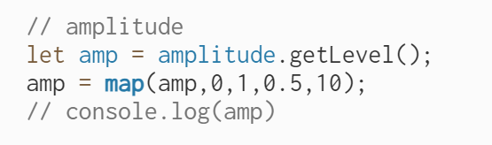
Solution: Using p5.Amplitude.getLevel() to get amplitude
3. How is the rhythm?
Solution: Beat detection with standard deviation
4. How high is the pitch in general?
Solution: Calculate the spectral centroid and see its tendency
5. What is the volume distribution in different bands? (Bass, midtone, hightone)
Solution: Calculate the sum of volume in each octave band or self-defined frequency region
6. Where are the highlights?
Solution: Identify the part of frequency range whose amplitude is above certain threshold
Finally, we come to the utimate questions:
- What is the flow of the music?
- How does the music feel like?
To answer these two questions, we need to employee the color and shape theories that we explored in the above to create the music visualizations that not only show the features, but also the emotion and flow of the music. We don't need additional feature extraction methods at this stage. All we need is to take the existing features, and organize them in a way that the complementation and interaction between them will show what we want in an aesthetic yet informative way.
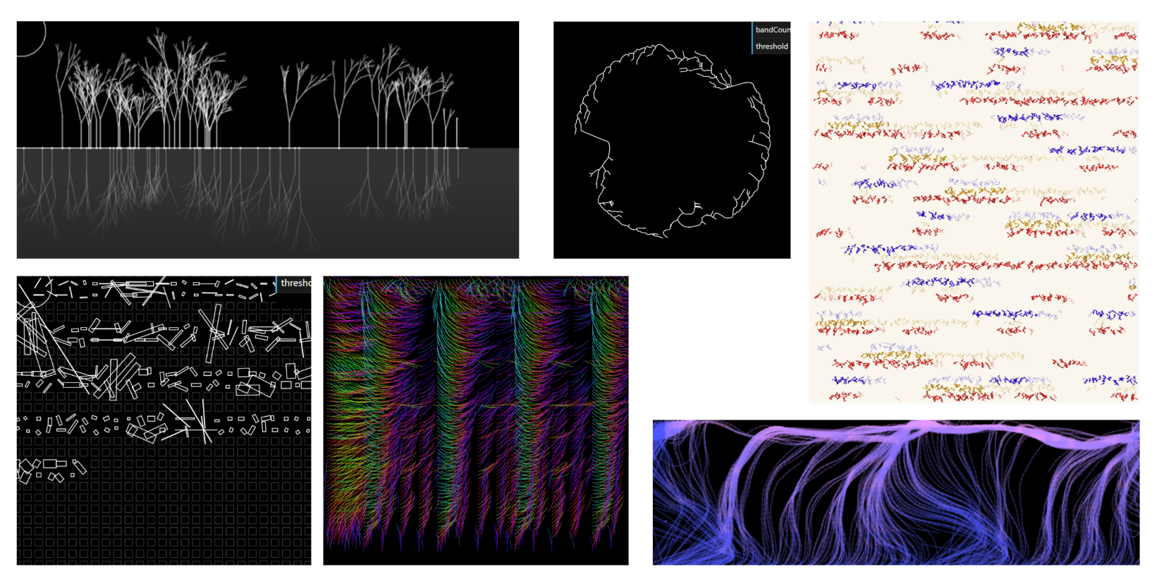
Here are the 5 final results.
Results
Category A: Music as generative rule
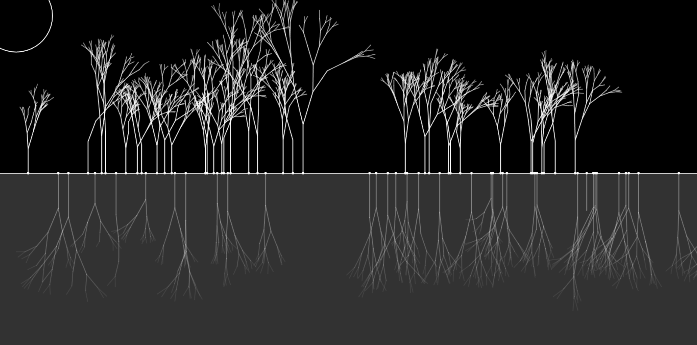
Peaceful Lake - I generate a fractal tree every time when there's a beat along the horizontal timeline. The growing speed of the tree is based on the amplitude at the moment the tree is being planted.
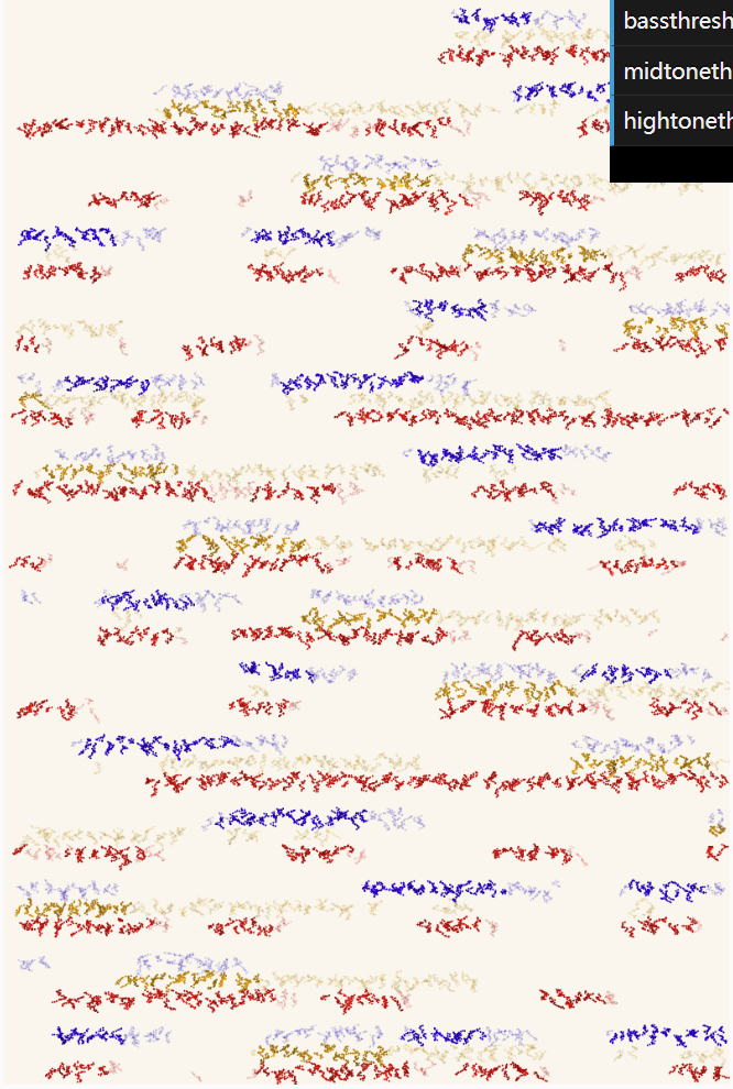
Scribbles - I record the sum of volume of 3 different frequency ranges (bass, midtone, hightone) and whenever the difference ratio exceeds the threshold, the scribbles with their representing colors will be drawn on the canvas.
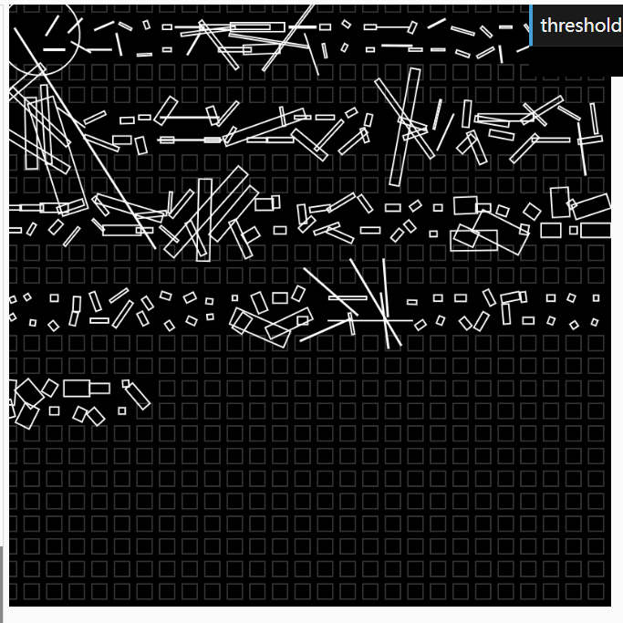
Minimal Shapes - I used squares to show the bass sounds and slim rectangles to show higher frequency sound. The shapes are bigger when the volume is high and smaller when the volume is low.

Category B: Music as force
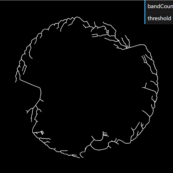
Roots - I place the particles that symbolize the FFT spectrum in a circular movement. Then I start to generate a space colonization tree. Each of the particles pulls the tree to its direction when the tree is near them.
Category C: Music as field
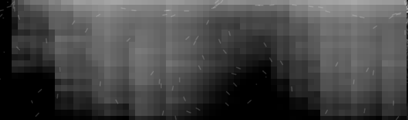
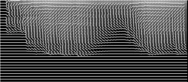
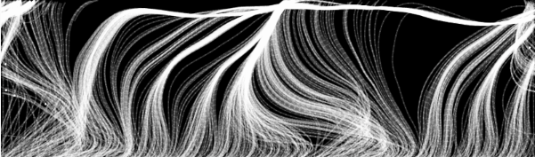
Flowfield - I take time and frequency bands as the x and y axis of my flowfield. The amplitude corresponding to each frequency band overtime will be the value of each pixel in the flowfield.
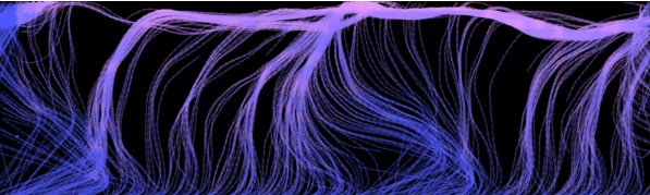
Colorful Grassland - Another exploration with music as field which is static.
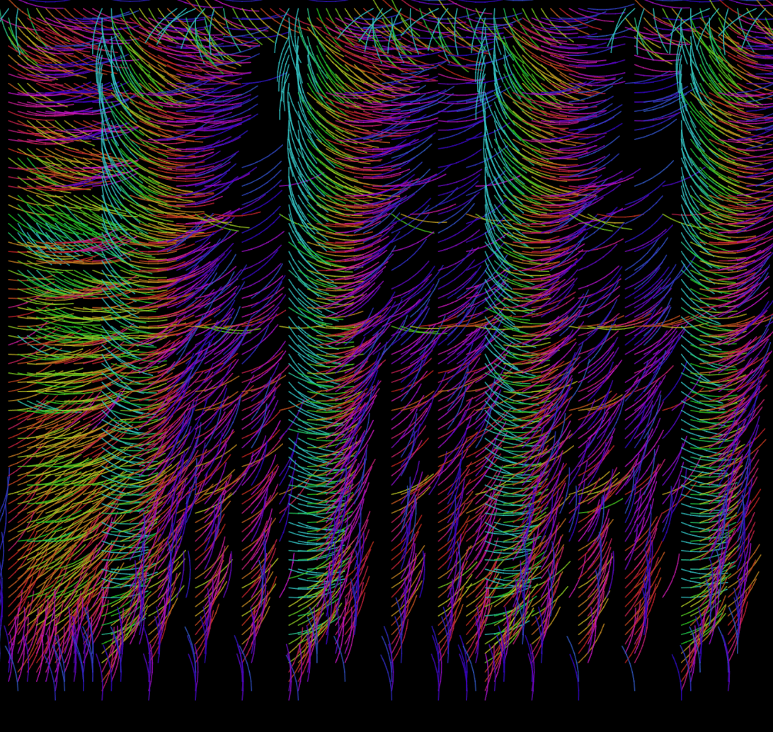
View Colorful Grassland Sketch
Part 3: Future Directions
Machine learning is a widely-used way for music classification and sentiment analysis. People will find it easier to detect beats and chords with the help of machine learning. However, it requires a large amount of source data to train the model and some knowledge of the machine learning process.
Different music have different amplitude range, therefore it's difficult to adjust the same extraction method, same frequency range and same threshold value to different music. It would be fantastic if we can create a highly customizable music visualization project with a beautiful user interface that make the users feel like they are DJs and in control of the visualization process.