
How do machines understand the relationship between different images?
Abstract
Embark on a journey through the eyes of machine learning with this interactive visualization.
Through using CLIP (Contrastive Language–Image Pre-training) to encode semantic image features and UMAP (Uniform Manifold Approximation and Projection) to reduce high-dimensional data , we unveil the hidden connections within flower images and visualize them in a 3D space with three.js. Explore the space, interact with the data points, and play with the parameters to understand how machine learning classifies sees the data and performs classification tasks.
Demo Video
Process
Part 1: Concept
How does the computer perceive an image? After that, how does it understand the relationship between different image objects? And how can these relationships be visualized in a way that humans can understand?
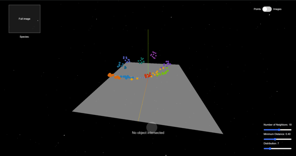
With those in mind, my project aims to give the viewers the freedom to explore the 3D clustering of flower images. By generating a set of embeddings using the openAI CLIP model, we grasp the essence of every image in a high-dimensional vector. Then with UMAP projection, we reduce the number of dimensions to a human-perceiveable scale, and locate the data points in a 3D space using three.js. The data points form a bunch of clusters, with flowers of the same species appearing near each other, showing that the computer understands the semantic similarity between their images.
The frontend interface of this project enables various user interactions. People can drag and scroll to navigate through the 3D space, to observe the distribution as well as the relationship between data points. They can click on any data point to reveal more information (such as the name and label). What's more, they will be able to modify the UMAP parameters for calculating the projection and re-locate the data points.
Throughout the process, I want to use "space" as a means to help people understand how machine learning sees the relationships between data points and completes the classification task. The project serves an educational as well as aesthetic purpose, as it integrates the interaction design of 2D and 3D interfaces into demonstrating the potential of embedding generation and dimension reduction.
Why I want to do this project:
I was amazed by the great potential of UMAP after reading Understanding UMAP and other related articles. Also, I'm very interested in interactive data visualization and its trend towards becoming 3D. Lastly, I always loved natural science, therefore, I want to use the knowledge that I learned in machine learning to create an interdisciplinary project that introduces people to something in the field of natural science.
Inspiration and prior art:
There are tons of amazing data visualization projects using UMAP or similar algorithms.
Firstly, this article serves as my initial source of inspiration: Understanding UMAP. I love how you can engage in the process by moving the sliders, or locating the same data point in different parameter contexts.
From this article, I found this amazing project (though not much related to my proposal): Flattening Mammoths. It shows the amazing result of dimension reduction from 3d to 2d.
This project is similar to what I want to do: Embedding Projector.
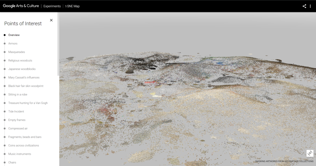
The TSNE artwork viewer by Google Arts is another amazing 3d project based on dimension reduction algorithms. This article is an experiment of a similar concept in three.js.
Part 2: Data Processing
Workflow
During the semester, we've been sending requests and fetching responses from Replicate, a web API with many open-source models. Replicate offers the CLIP model to generate embeddings, however, it takes a very long time to generate embeddings for a larger number of images. What's more, the Replicate model only takes image URLs as input instead of actual files. Therefore, I think it's not a practical way to get embeddings for the whole flower dataset.
I also researched the transformers.js library, which integrates better with my front-end app. Unfortunately, they don't offer the CLIP model yet and can only generate embeddings for text at this point.
Therefore, I decided to learn to process data with Colab notebooks. With the transformers API and plenty of online resources, it's easy to import the image dataset and the CLIP model, and process the data.
Dataset
Dataset: Oxford-flowers dataset from Hugging Face
I chose this dataset because it has not only the labels, but also the class name of the flowers. It also has a dictionary of label-name pairs.
Data Processing
To ensure the performance of the frontend project, I pulled out a small sample of data for visualization: 10 classes of flowers and 10 individuals for each class. Then I send this small dataset to the CLIP model for the embeddings and store them with the base64 images in separate objects in an array.
A huge thank you to this tutorial for code references!
Data Storage
As we discussed in the concepts, the data processing consists of two main steps:
- Use CLIP to generate embeddings for every flower image to describe it with a high-dimensional vector.
- Use UMAP.js to reduce the high-dimensional vector to lower dimensions (3D or 2D) so that they can be located in a human-perceivable space.
The first step is done in the Google Colab. After generating the embeddings, I store the embeddings, along with the image and its label/class name in Google Firebase. On the webpage, the users can easily fetch the data from Firebase and don't need to generate them in realtime, making the project more responsive. Meanwhile, since the UMAP projection is generated realtime, it's possible to allow users to customize their parameters for UMAP.
Part 3: Design and Implementation
The interface consists of two main parts:
- The three.js rendering
- The HTML interactive components
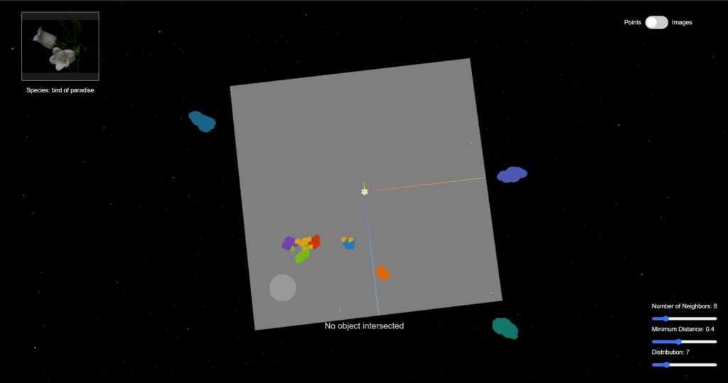
I use the three.js library to position the data points in the 3D space after dimension reduction. Actually, I set the UMAP projection result to be 2-dimensional to form a clearer cluster and make it easier for raycasting and observing the data. Then how should the data be distributed along the z-axis? (How should we determine the "height")
I map the value to the data point's average distance from other data points, so that the data points will form a terrain-like structure while having some diversity in height.
The 10 classes of flower data points are demonstrated by spheres of 10 different colors. You can hover your mouse on any of the data points to secure this object and see its label. This is done by the raycaster in three.js. You can also drag and scroll to see the data clusters from different angles and distances.
I added some interactive visual effects to the data points. Since the data is about flowers, why not have a "digital blossom" in the 3D world? I imported a GLTF flower model and wrote functions for scaling it up and down. Whenever the mouse is hovering over a data point, flowers will appear out of it and the data points near it, and when the mouse is moved away, flowers will scale down gradually and disappear.
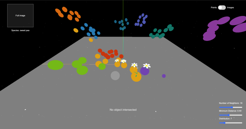
There are some interactive components in the HTML interface. Firstly, a toggle to switch between displaying data points using colored spheres and images. Also, there is a placeholder on the up-left corner for displaying the full image and label of the currently selected data point (double click to select). These features allow users to view more information about the data and figure out why some individuals are placed in the wrong cluster. This can help us understand why computers sometimes make the wrong prediction. This is an example of individual difference that is worth noticing.
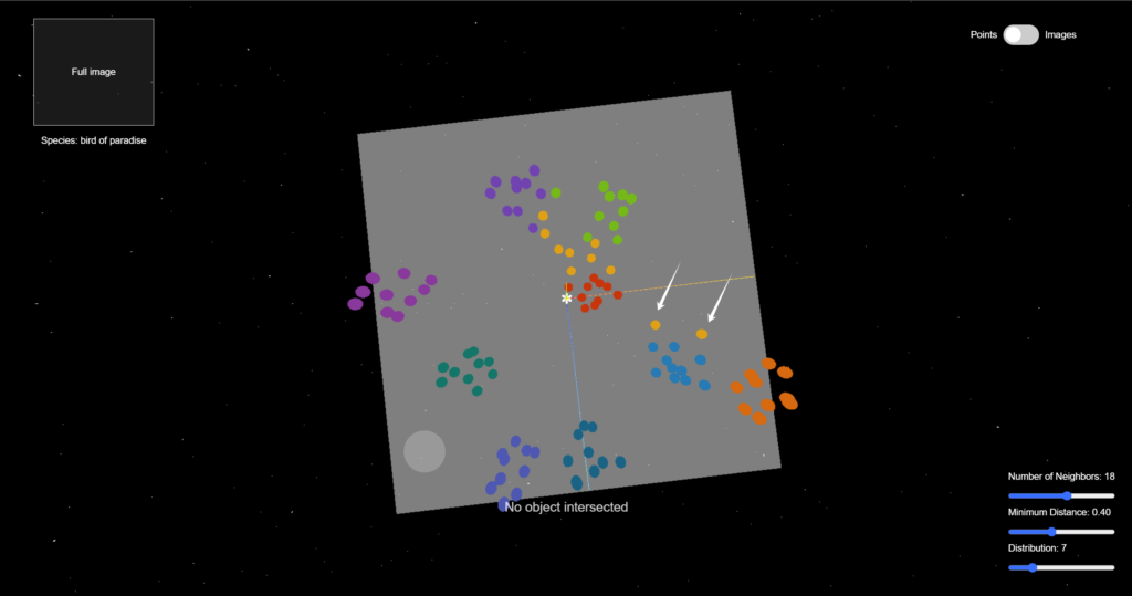
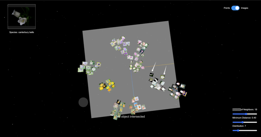
In addition, the sliders in the bottom-right corner allow the users to modify the UMAP parameters and regenerate the projection. For example, if we reduce the number of neighbors, the data points of the same class will appear closer to each other, and the gap between different clusters will be clearer.
Part 4: Reflection and Future Direction
I enjoyed this project and this class very much. In class, we not only learned about technical things, but also reflected on how our minds perceive time and space on a conceptual level.
In this project, I tried to combine those two aspects and create a project that brings up the question of how humans and computers understand data differently, and how to bridge this gap with an interactive and aesthetic approach.
There is still much space for improvement:
- Optimization of performance. Now with 100 data points, the webpage is already lagging sometimes, probably because of the image size. I plan to reduce the image size to improve the user experience.
- The HTML sliders don't work properly (can't be dragged smoothly) I tried with z-index and changing the event listener type, but neither worked.
- The fade-in and fade-out effect of the flowers can be better designed.
- Create a unique visual style for the web interface
In the future, I want to make this project into an "interactive 3D encyclopedia", where people can view and learn about more species in a non-traditional way while appreciating the beauty of nature.